Visualizing Data
SDS 192: Introduction to Data Science
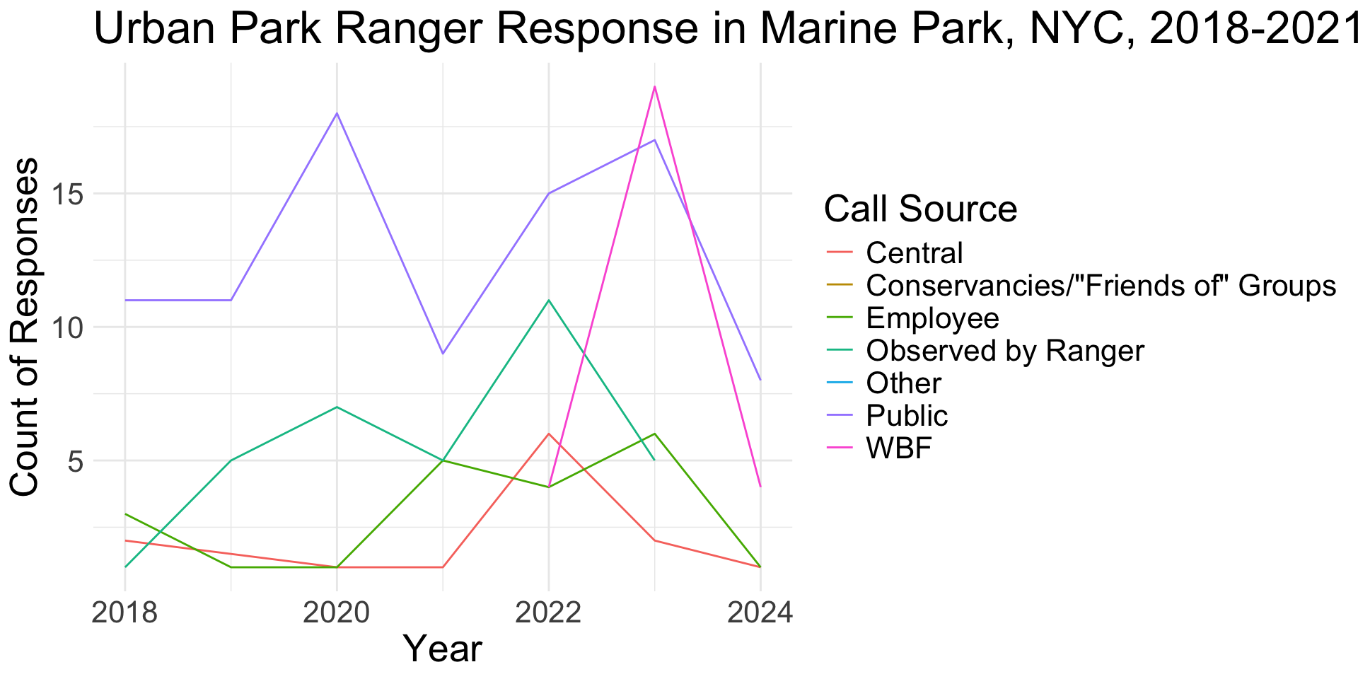
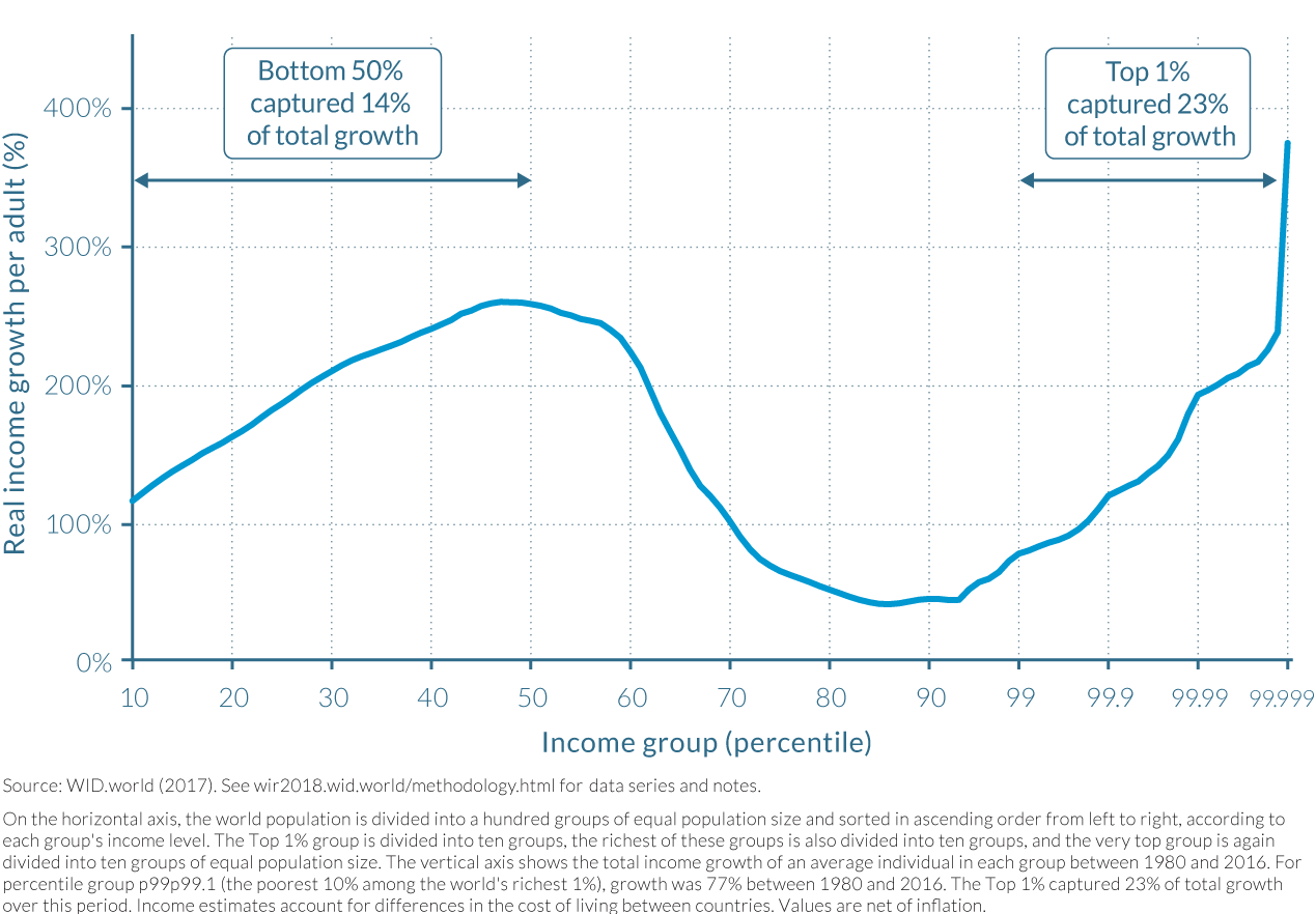
What variables mapped onto what visual cues?
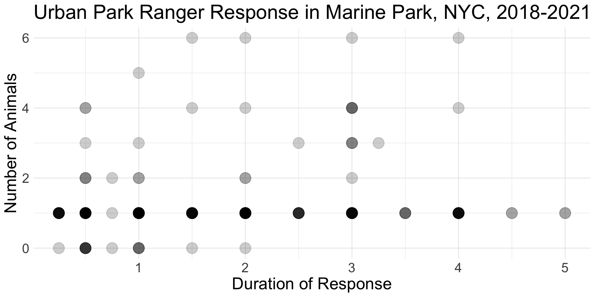
What variables mapped onto what visual cues?
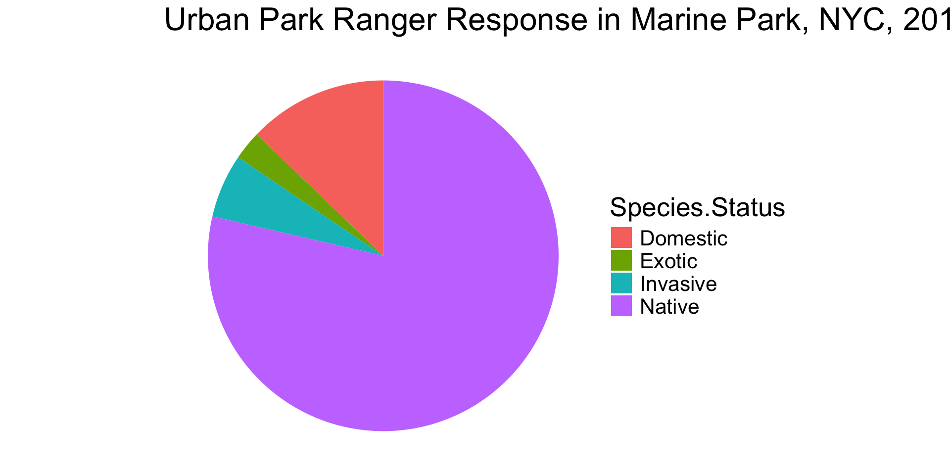
** This is the last time you will see me use a pie chart in this class!
What variables mapped onto what visual cues?
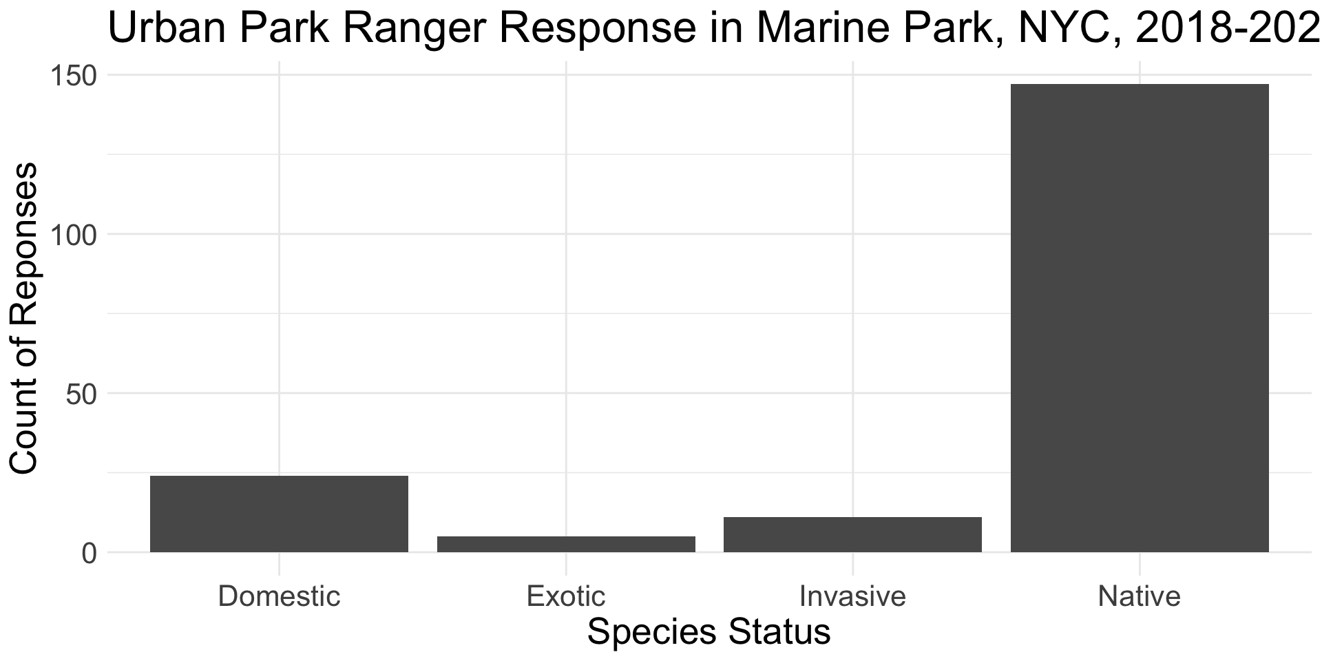
What variables mapped onto what visual cues?
What variables mapped onto what visual cues?
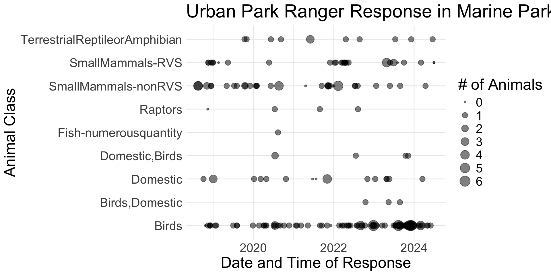
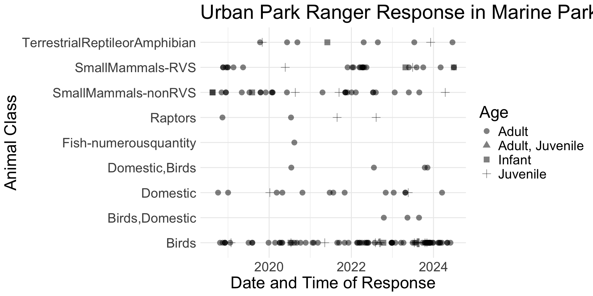
What variables mapped onto what visual cues?
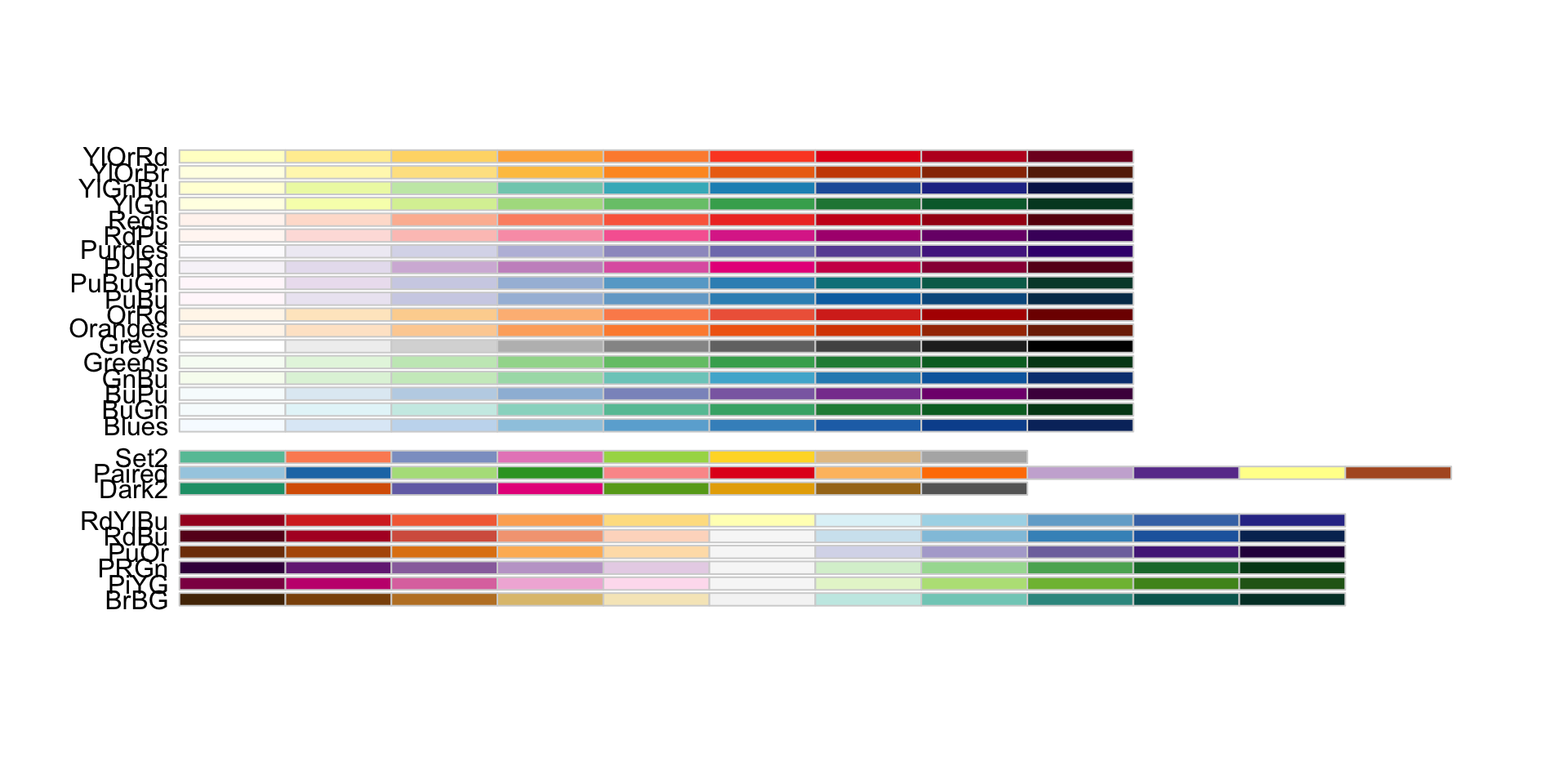
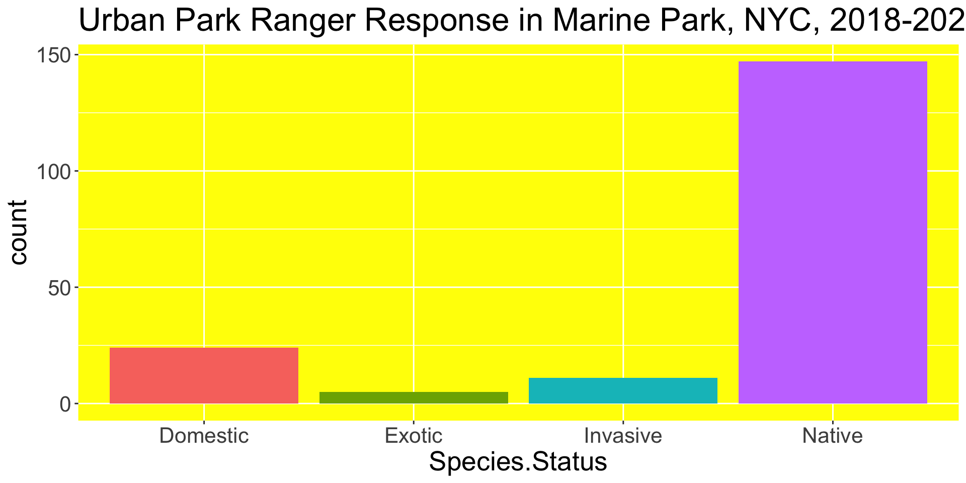
Accessible Color Palettes
Examples
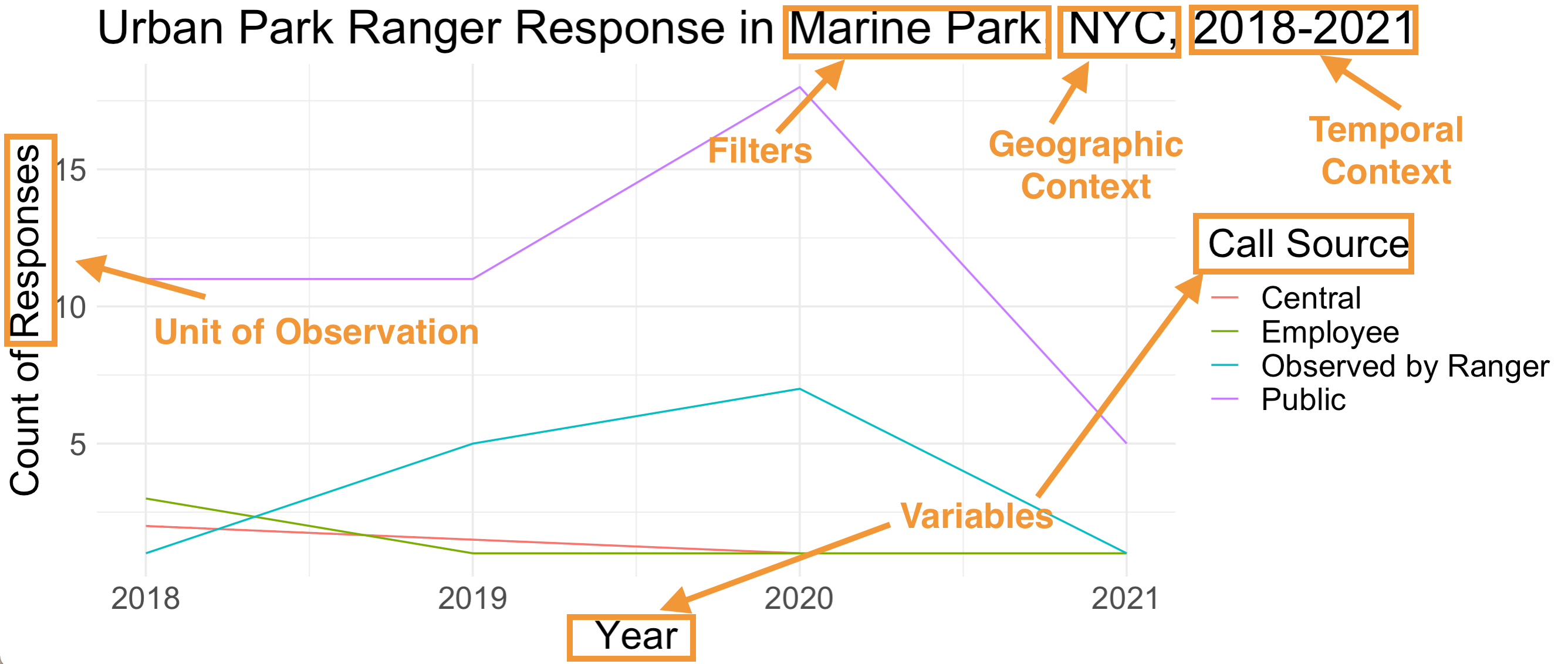
Context
Lie Factor
- Lie Factor = (size of effect in graphic)/(size of effect in data)
- Lie factor is greater when variations on a graph fail to match variations in data
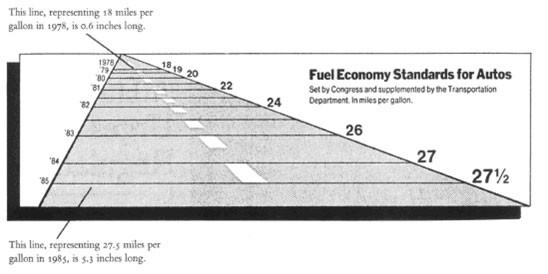
Tufte, Visual Display of Quantitative Information
Inconsistent Scales
Example from callingbullshit.org
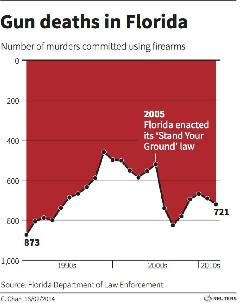
Presenting Data out of Context

Example from mediamatters.org
Disproportionate Data-to-Ink Ratio
Deviating from Norms
Example from callingbullshit.org