library(tidyverse)
pioneer_valley_census_data <- read_csv("https://raw.githubusercontent.com/SDS-192-Intro/public-website-fall-25/refs/heads/main/data/pioneer_valley_census_2022.csv")
pioneer_valley_census_data_dictionary <- pioneer_valley_census_data |>
select(VAR_CAT, VAR, VAR_NAME) |>
distinct()
pioneer_valley_census_data <- pioneer_valley_census_data |>
select(-VAR_CAT, -VAR) |>
pivot_wider(names_from = VAR_NAME,
values_from = VALUE) |>
filter(LEVEL_CD_NAME != "Region")
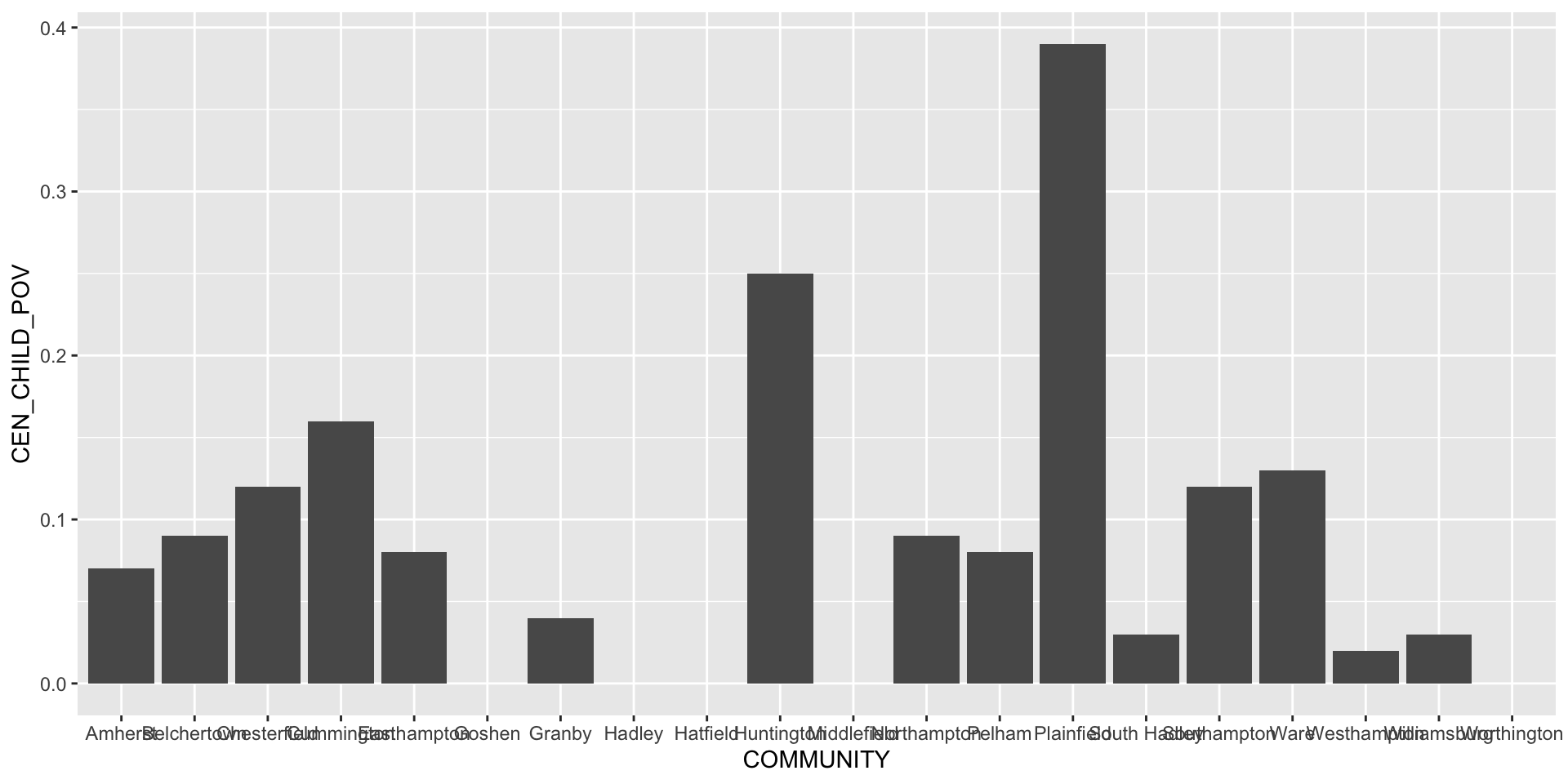
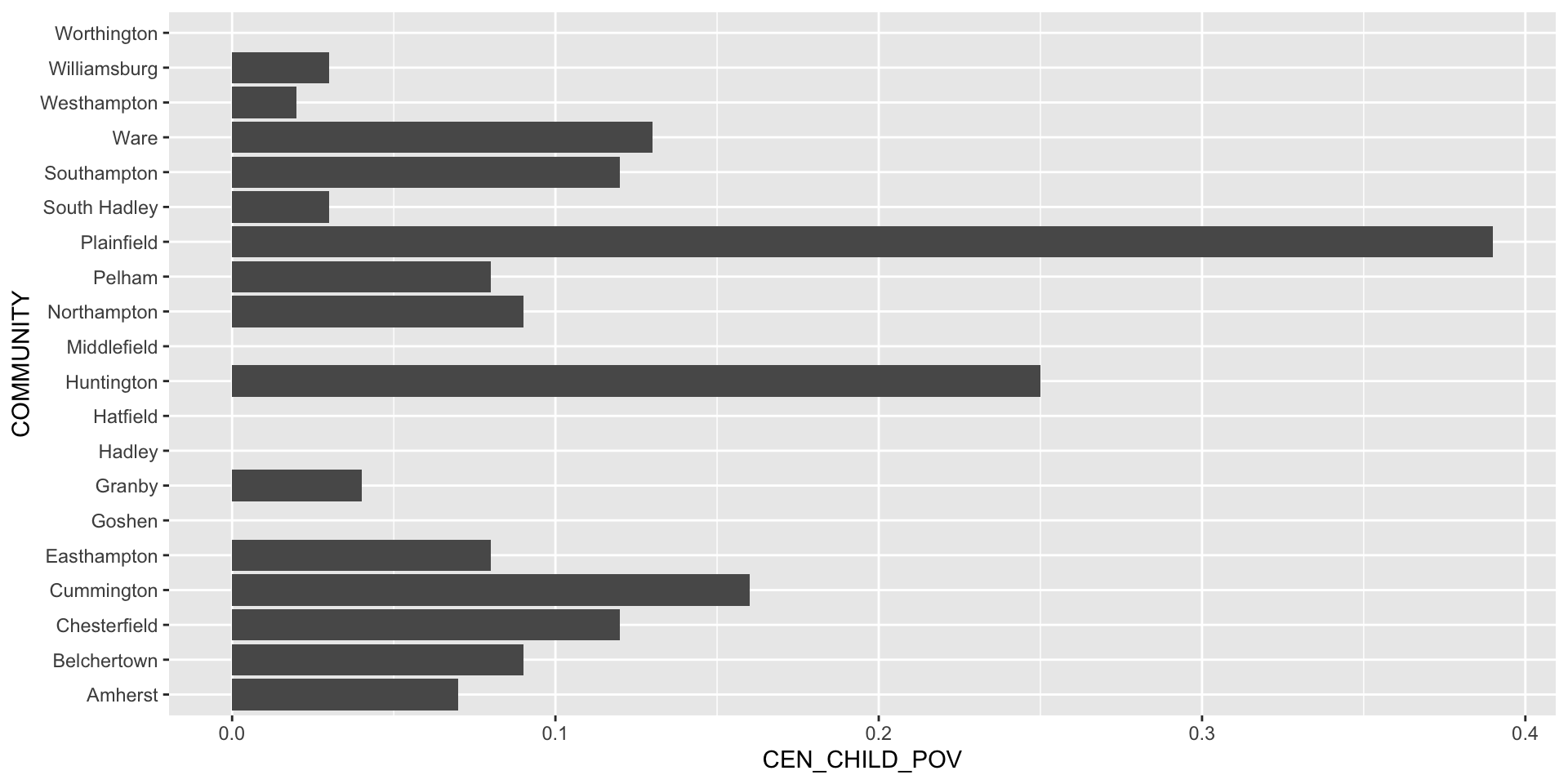
hampshire_census_data <- pioneer_valley_census_data %>%
filter(COUNTY == "Hampshire")ggplot()
SDS 192: Introduction to Data Science
Anatomy of the ggplot() function
Adding a geom function
Styling Plots: Flipping Coordinates
Styling Plots: Changing the Theme
Styling Plots: Adding Labels
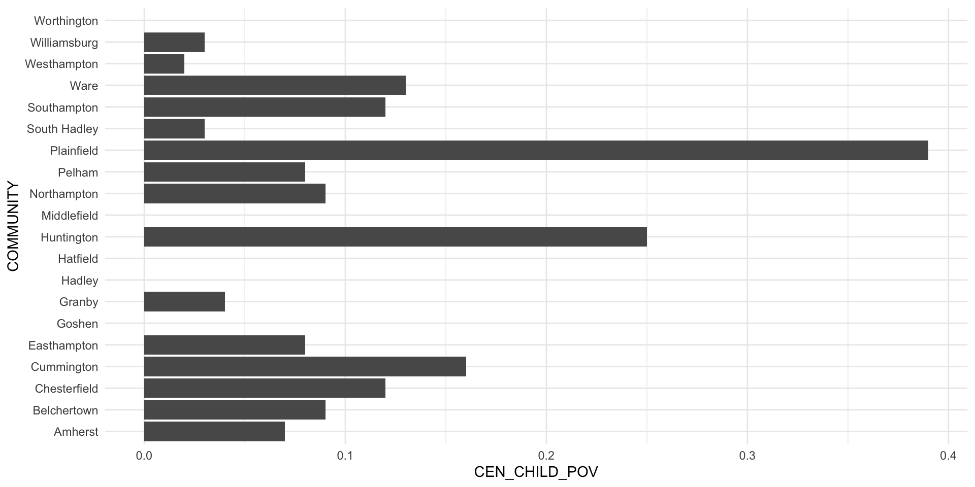
ggplot(data = hampshire_census_data,
       aes(x = COMMUNITY,
y = CEN_CHILD_POV)) +
geom_col() +
coord_flip() + # Flipping the x and y coordinates here makes the labels more legible.
theme_minimal() +
labs(title = "Hampshire County Child Poverty, 2022",
x = "Municipality in Hampshire County, MA",
y = "Child Poverty Rate")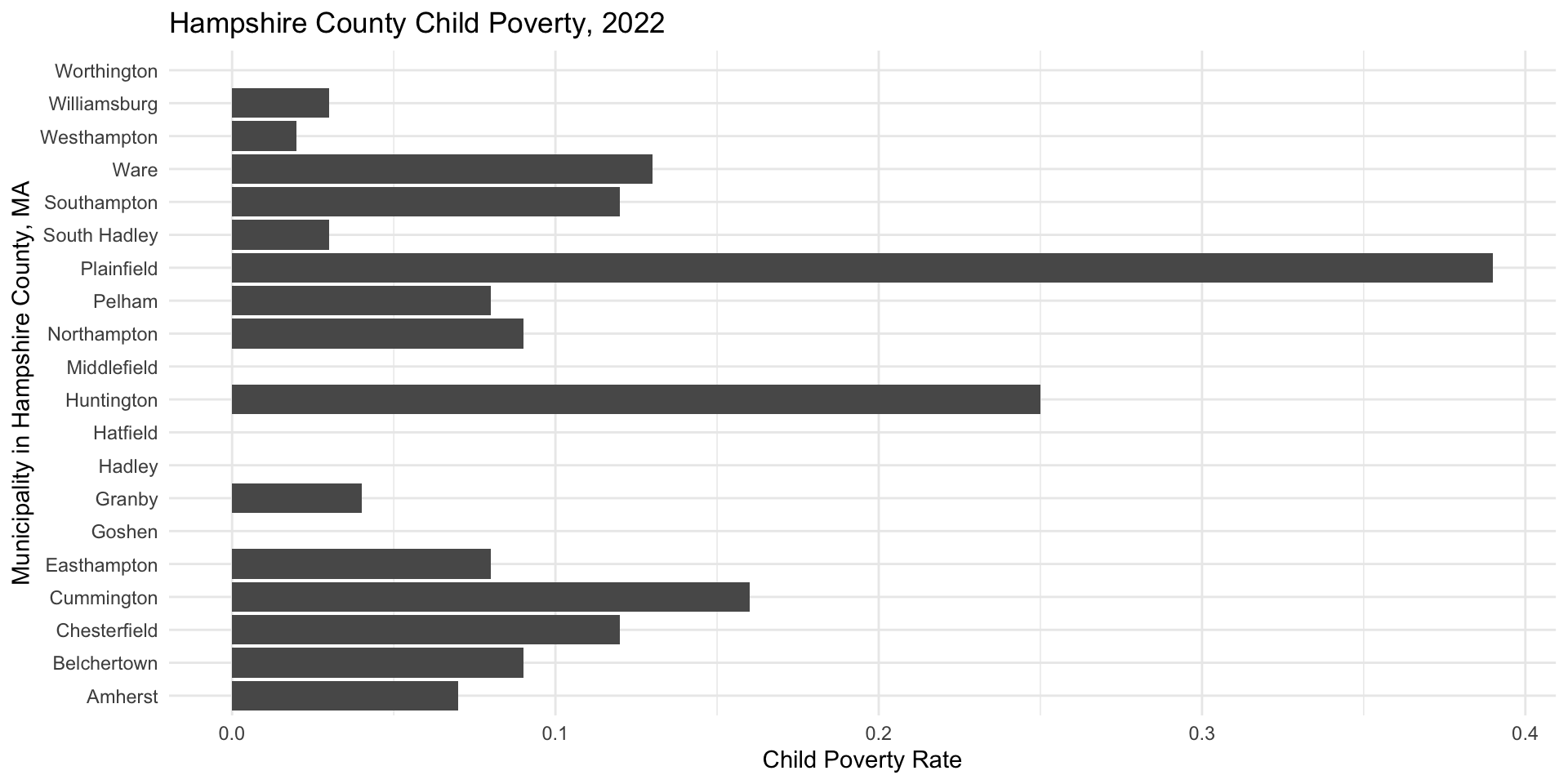
Styling Plots: Adjusting the Scale
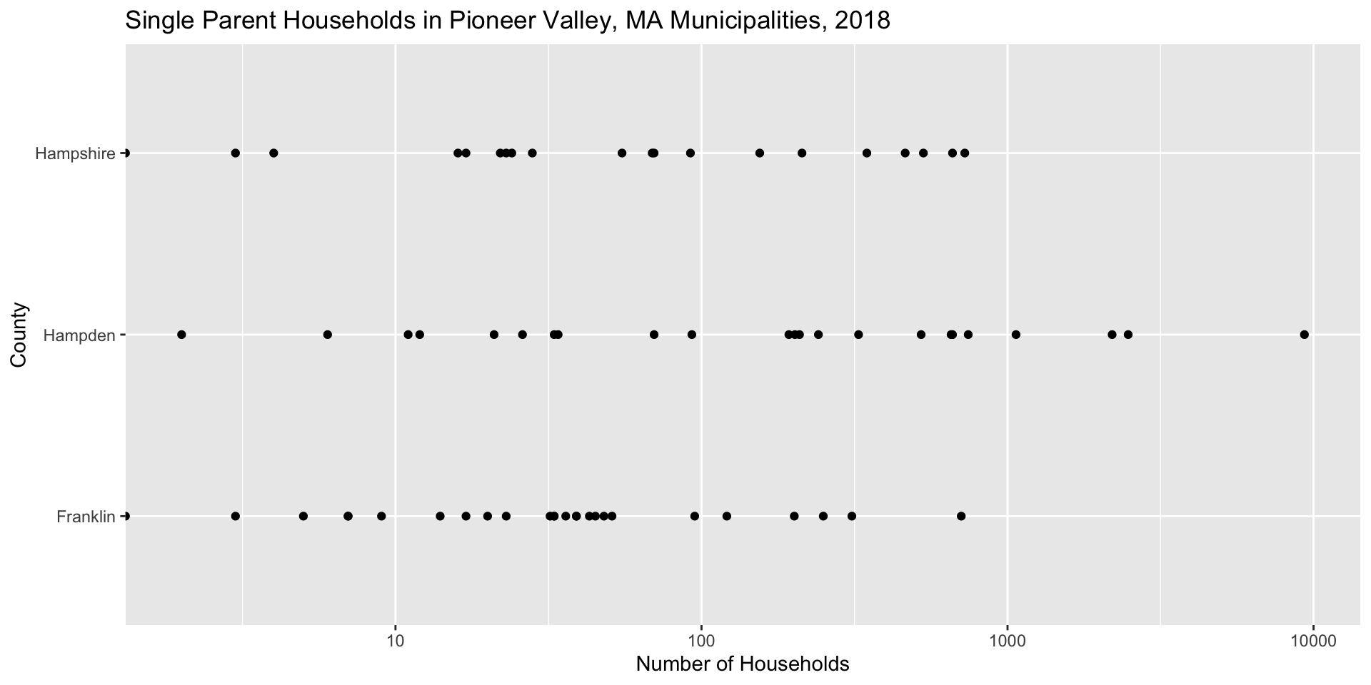
Adjusting Data on Plots via Aeshetics
We add visual cues to the plot in the
aes()call
# Add visual cue for size
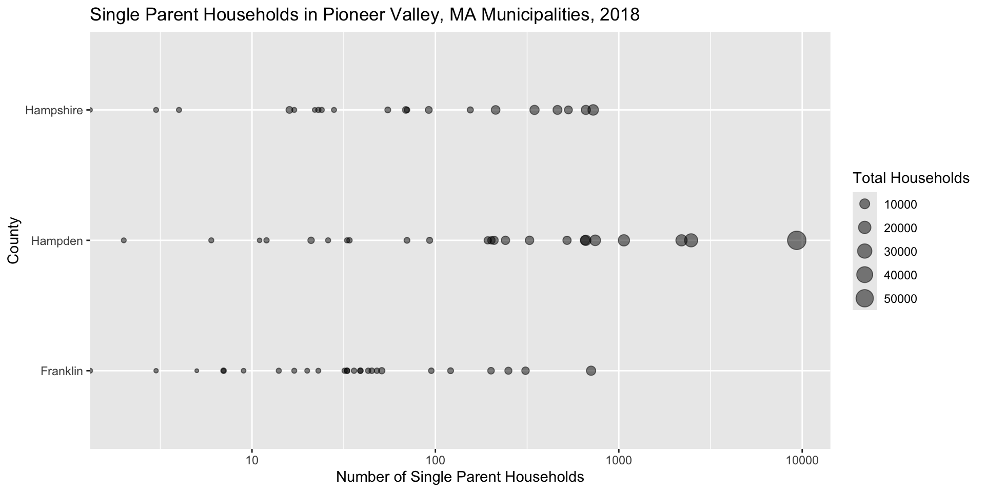
ggplot(data = pioneer_valley_census_data,
aes(x = COUNTY,y = CEN_SINGPARHOU, size = CEN_HOUSEHOLDS)) +
geom_point() +
coord_flip() +
scale_y_log10() +
labs(title = "Single Parent Households in Pioneer Valley, MA Municipalities, 2018", x = "County", y = "Number of Single Parent Households", size = "Total Households")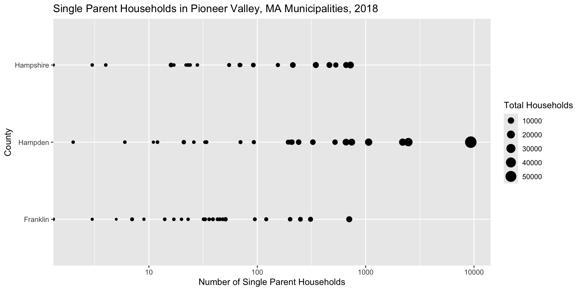
Adjusting Data on Plots via Attributes
# Add visual cue for size and attribute for transparency
ggplot(data = pioneer_valley_census_data,
       aes(x = COUNTY,y = CEN_SINGPARHOU, size = CEN_HOUSEHOLDS)) +
  geom_point(alpha = 0.5) +
  coord_flip() +
  scale_y_log10() +
  labs(title = "Single Parent Households in Pioneer Valley, MA Municipalities, 2018", x = "County", y = "Number of Single Parent Households", size = "Total Households")